Checking out the Toptal blog for the latest graphic design articles I’ve came across a very interesting one featuring a logo refresh. Generally speaking , just in case you don’t know exactly what that is, we’re talking about changes made to an existing, well established logo, to update it to present times and to keep up with the brand evolution, but maintaining the same brand essence and identity.
In this article the logo that goes through the refreshing process it’s the Zumba logo. Here you have the original on the left and the new, refreshed version on the right:

In the first place I have to say that I appreciate a lot the work of my fellow designers and I consider they did a great job refreshing the logo, but keeping the same Zumba playfulness. Yet, I felt that something was missing in the new logo, I felt it became more rigid and masculine. Therefore I thought to give it a try myself, to make a logo refresh on my own just to try out my skills and to see if I could come up with something that feels more “Zumba”.
The logo refresh process
The logo/brand refresh it’s tricky because you need to make changes to the original logo, but in the same time preserving its identity, the feeling that the original logo had, making sure the logo remains easily recognizable to its clients. As a consequence the logo refresh process is very different from the logo design process where you start from scratch.
I’ve started choosing the keywords that define the Zumba logo and should also be reflected in the new one. These are: playful, feminine, positive and energized. I think it’s important for this logo to have a nice, more feminine touch, as its target audience is made mostly out of young women. The words playful, positive and energized are keywords that describe perfectly Zumba, which based on dance and aerobics.
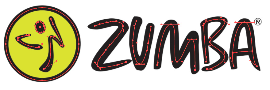
I moved on to trace over the original logo, creating sort of a skeleton on which I’ve started to work.


I made some changes to the letters, trying to keep that nice bounce, the playfulness and the feminine feeling. The most challenging part was the circle icon with the dancing silhouette. I didn’t liked that in the original version the silhouette seemed to be turned away from the logo making it feel odd, so I’ve changed its direction. I also redesigned the right side of the silhouette to be energetic but feminine in the same time.
Here is my proposal:

Conclusion
Few ideas as a conclusion for my logo refresh:
- The letters are more spaced and thinner so they feel lighter and feminine.
- I kept the bounce of the letters to keep that playful and original feel.
- The symbol and the letters are pointing to the right which is considered to induce a positive feel.
- The circle’s outline it’s not uniform, inducing the idea of movement and playfulness.
- The dancing silhouette it’s also lighter and more energetic capturing movement.
- The letters B and A suffered most changes: B has another shape, more round, while the A is bent toward the B making the logo to look more balanced and compact.

