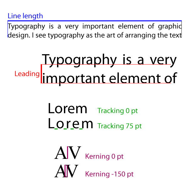
Typography is a very important element of graphic design. I see typography as the art of arranging the text in such manner that it’s easy to read, pleasing to the eye and consistent with the overall concept of the design.
When I design a text, whether it’s about a brochure or a logo, the typeface (or commonly known as font family) is the element I start with. There are thousands of different type faces, created over time, and they range from calligraphic to modern sans serif. Choosing the best typeface is not an easy task,but there are typefaces more suitable for logos, and other more suitable for bigger blocks of text, like a website or a brochure.
The height of the font (or the font size) is exactly what it says: the height of the letters measured in points. Choosing a certain font size usually depends on the typeface and the final purpose of the design. Is it well known that small text is difficult to read so, in order to be readable the font size should be at least 12 points.
Line length is the width of a block of text and it’s another element to take in consideration especially when we have large amounts of text involved. The long lines of text are more difficult to read so the guidelines say that the line length should range between 45 and 75 characters per line.
Leading is the space between the lines of text and can also influence the readability of the text. The setting for leading should be 120%-145% of the font size, to make the text easier to read.
Other two important elements in typography are tracking (letter-spacing) and kerning (space between individual letter forms). As you can see, these two concepts are letter related so they are more subtle than the other elements.
A larger space between the letters, as long as it’s not too large, makes the text lighter and readable, but sometimes, a smaller space between the letters can fix aesthetic issues. The kerning is mostly used in logo design to create more appealing text. Usually the kerning adjustment is negative, making letters to enter one beneath the other.